THE GOLDEN CUT TREE SERVICE
Hammond Forestry Rebrand
A local tree service company came to me with the request of helping them enhance their brand through naming and logo design. The client felt that Hammond Forestry felt unapproachable, so they wanted to give their company a new name as well as a more high-end look to draw in bigger clientele.
First Round Concepts
The Conversation Starters
The first initial concepts of this rebrand were done quickly to gauge what the client really wanted the brand to look like, and to start the conversation of who they would be as a brand. The naming started around "The Golden Touch" and the client was thinking of playing off of the idea of King Midas, who would turn anything he touched to gold (driving home the idea that he does a top-notch job.) After advising the client that might make it unclear what his business was, as well as getting really close to Midas Car Care, we moved on to the name of The Golden Cut Tree Service.
The word GOLDEN implies a high level business that provides excellent, top of the line services. CUT gets across the idea of trimming and cutting trees. Finally, using TREE SERVICE in the name removes any confusion of what this company does.

Second Round Concepts
After feedback and many discussions, the two logos above were proposed to the client to use for their business. The first logo was highly client driven and features a chainsaw as a graphic element that is used along a bold, condensed typeface to portray strength. I was concerned about using this logo on many applications and its ability to scale well due to the amount of detail.
The second logo has a simple, identifiable element that represents a chainsaw blade. The typeface chosen has notches taken from the G's and the C's to further the idea of cutting and to give the logo a certain stylistic feel.

THIRD ROUND CONCEPT
While the client liked the second logo, he was concerned that the saw element was not clearly communicating a chainsaw blade, and wanted to see a few more options that the blade would resemble a chainsaw more than a table saw. The client originally asked to see an entire chainsaw blade, but I felt that it was hard to balance and was just too literal.

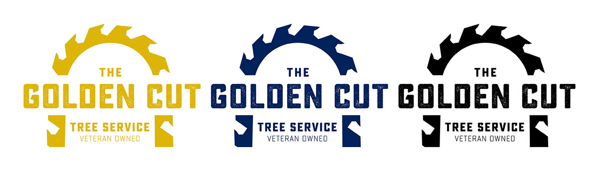
The Final Logo
I took the logo a step further to the second one shown. By making the shape less circular, it felt more like a chainsaw blade. Making the blade thicker and more prominent, as well as distressing the type slightly, gave the logo the rugged, yet quality feel the client was searching for.

Logo Application
I helped the client create business cards, yard signs and T-shirts. I gave him samples of what other applications could look like and guidelines of how to use the branding.


